Hillary Clinton and her strategy to speak
Text analysis in R on speeches is one way to find some new untold stories in the presidential election discussion. In this post we will concentrate on Hillary Clinton and her strategy to speak

“I’m in, and I’m in to win: 2008 vs. 2016
To compare Clinton’s potential candidacy in 2008 with her current one, we will scrape speech data from both campaigns. Her 2016 speeches are available on Hillary’s campaign website, while speeches delivered 2007 and 2008 are to be found here.
 To end up with a relative reliable sentiment line, we will use the tidytext package, by David Robinson and Julia Silge. Both made a great effort to explain examples on their blogs (Julia Silge, David Robinson).
library(tidytext)
library(tidyr)
library(ggplot2)
library(viridis)
library(grid)
library(directlabels)

nullacht_speeches <- pr_2008_clean %>%
  mutate(linenumber = row_number()) %>%
  mutate(text = as.character(text))

tidy_nullacht_speeches <- nullacht_speeches %>%
  unnest_tokens(sentences, text, token = "sentences") %>%
  mutate(speech_08 = row_number())

tidy_nullacht_speeches <- tidy_nullacht_speeches %>%
  unnest_tokens(word, sentences) %>%
  group_by(speech_08) %>%
  mutate(linenumber_word = row_number()) %>%
  mutate(numberWords = n()) %>%
  ungroup()

# do more cleaning
data("stop_words")
tidy_nullacht_speeches <- tidy_nullacht_speeches %>%
  anti_join(stop_words)  # remove all the stop words

# counts words
tidy_nullacht_speeches %>%
  count(word, sort = TRUE)

# load sentiment lexicon
bing <- sentiments %>%
  filter(lexicon == "bing") %>%
  select(-score)

# Calculate sentiment score
All_sentiment_All <- tidy_nullacht_speeches %>%
  inner_join(bing) %>%
  count(Dates, numberWords, index_word = linenumber_word %/% 1, sentiment) %>%
  spread(sentiment, n, fill = 0) %>%
  mutate(sentiment = positive - negative)
All_sentiment_standard_All <- All_sentiment_All %>%
  group_by(Dates) %>%
  mutate(Overall_sentiment = sum(sentiment)) %>%
  mutate(max = max(index_word))%>%
  mutate(min = 1)%>%
  ungroup() %>%
  mutate(index_stan = (100*index_word)/max)

# Plotting:
ggplot(All_sentiment_standard_All, aes(index_stan, sentiment, label = Dates)) +
  theme_bw() +
  #geom_jitter(height = 0.4, show.legend = F, alpha = 0.1) +
  ggtitle("Hillary's 2008 presidential election speeches") +
  geom_line(stat="smooth",method = "loess", size = 0.3, show.legend = F, aes(alpha = 0.1, group = Dates, col = sent)) +
  scale_colour_gradient(limits=c(-63, 83), low="navy blue", high = "red") +
  geom_smooth(method = "loess", show.legend = F, size =2) +
  xlab("Standardized sentence index") +
  ylab("Sentiment (+/-)") +
  ylim(-2, 2)
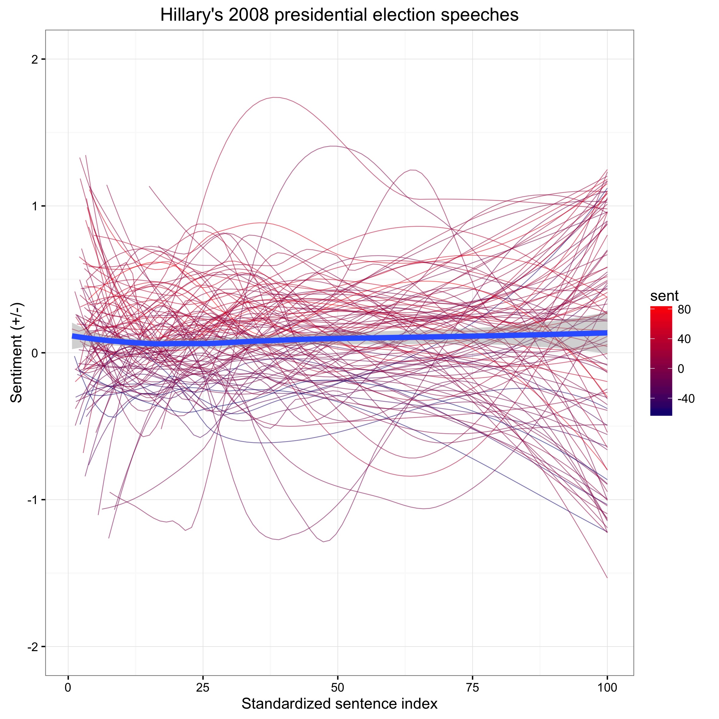
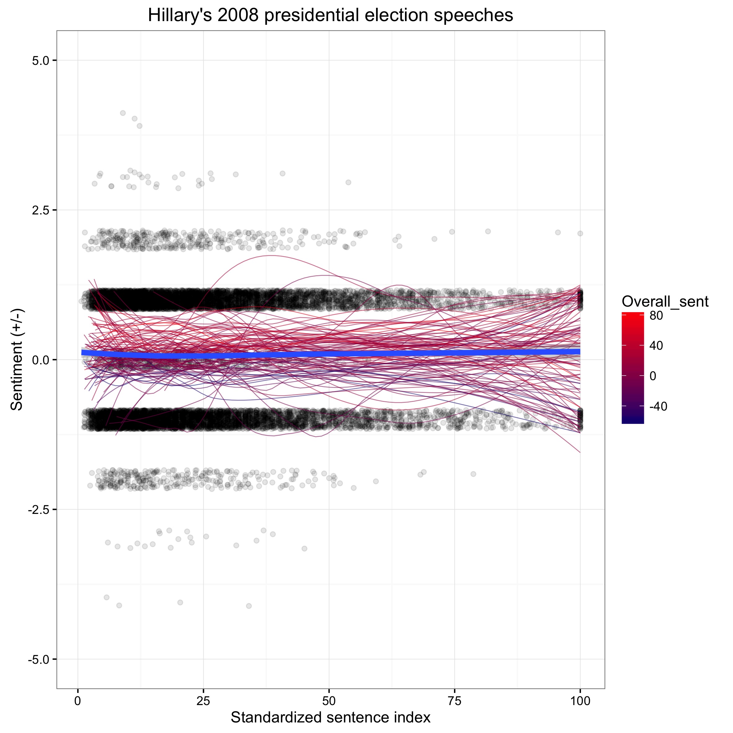
Now we can add also the individual sentence scores to the picture. We can do the same for her 2016 speeches and you may notice a difference:
Here the same plot on Hillary’s 2016 speeches:
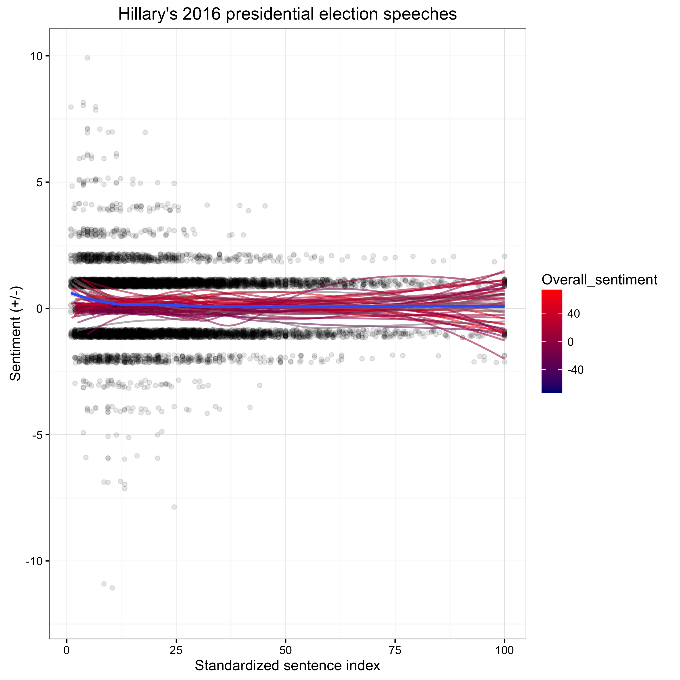
The dots represent the sentiment scores for each sentence in all of her speeches for that year. The red lines represent a weighted average line, one for each of Hillary’s speeches. We can see that the distribution of the dots are slightly more spread out for 2016. The difference of the spread of the black dots tells us that Hilary Clinton may have made more use of more judgemental verbs and nouns in sentences in 2016 than in her 2008 campaign, while her overall sentiment across speeches remained relatively balanced.
Convention speeches:
 After the conventions, it became clear Clinton will go against Trump in the election finals. Earlier we learned that Clinton is generally balanced in her sentiment. Listeners to the convention speeches noted how negative Trump’s speech was compared to others. Similar to her campaign speeches, Clinton’s speech at the 2016 convention was generally considered to be rather balanced, except when she discussed how unfit her opponent Trump is for presidency.
To measure sentiment in convention speeches, we use Julia Silge’s and David Robinson’s tidytext package again. First we load also dplyr and stringr for some basic data wrangling.
library(tidytext)
library(dplyr)
library(stringr)
Speeches.19_clean_Democrats <- Speeches.19_clean %>%
   filter(party == "Democratic")
Speeches.19_clean_Republican <- Speeches.19_clean %>%
  filter(party == "Republican")
conv.all_Dem <- Speeches.19_clean_Democrats %>%
  group_by(title) %>%
  mutate(linenumber = row_number()) %>%
  ungroup() %>%
  separate(title, c("speaker", "Years"), sep = "_", remove=FALSE)
The next thing is to unnest the text into words. We also load in stop words and use dplyr’s “anti-join” to clean the data from filler words and subordinating conjunctions. Another thing we arrange is to involve the bing lexicon dataset. It will allow us to express each word’s sentiment.
tidy_All_Dem <- conv.all_Dem %>%
  unnest_tokens(word, text)
data("stop_words")
tidy_All_Dem <- tidy_All_Dem %>%
  anti_join(stop_words)
tidy_All_Dem %>%
  count(word, sort = TRUE)
library(tidyr)
bing <- sentiments %>%
  filter(lexicon == "bing") %>%
  select(-score)
All_sentiment_Dem <- tidy_All_Dem %>%
  inner_join(bing) %>%
  count(title, index = linenumber %/% 1, sentiment) %>%
  spread(sentiment, n, fill = 0) %>%
  mutate(sentiment = positive - negative) %>%
  separate(title, c("speaker", "Years"), sep = "_", remove=FALSE)
Now we are good to go to plot. We use ggplot’s facet_wrap() function and a weighted LOESS line and n set to 50.
library(ggplot2)
library(viridis)
library(grid)
library(directlabels)
All_sentiment_standard_Dem$title <- factor(All_sentiment_standard_Dem$title,
levels = (All_sentiment_standard_Dem$title[order(All_sentiment_standard_Dem$Years)]))
ggplot(All_sentiment_standard_Dem, aes(index_stan, sentiment, group = title)) +
  scale_colour_brewer(palette = "Set1") +
  geom_path(show.legend = F, alpha = 0.3, linejoin = "mitre", lineend = "butt", aes(col = if_else(hillaryClinton_line == 0, "red", "grey"))) +
  facet_wrap(Years~speaker, nrow = 2, scales = "free_x") +
  theme_minimal(base_size = 13) +
  labs(title = "Sentiment in democratic US presidential candidates convention speeches",
       y = "Sentiment") +
  geom_smooth(method = "loess", n = 50, show.legend = F, aes(col = if_else(hillaryClinton_line == 0, "red", "grey"))) +
  scale_fill_viridis(end = 0.75, discrete=TRUE, direction = -1) +
  scale_x_discrete(expand=c(0.02,0)) +
  theme(strip.text=element_text(hjust=0)) +
  theme(strip.text = element_text(face = "italic")) +
  theme(axis.title.x=element_blank()) +
  theme(axis.ticks.x=element_blank()) +
  theme(axis.text.x=element_blank()) +
  geom_dl(aes(label = toupper(Years)), method = list(dl.trans(x = x - 1.3), "last.points", cex = 0.5))
The plot shows the sentiment analysis for democrate convention speeches over the past years. A blue weighted loess line is introduced that shows a general trend over the course of each speech. Clearly Hillary’s speech is rather balanced. We can do the same thing for the republican convention speeches and witness one of the most negative talks over the past decades by candidate Trump.
Length: Over the past three decades, convention speeches significantly varied in their length and while Bill Clinton’s convention speech listeners in 1996 must have a hard time to stand his 7,000 words, other candidates such as Mondale kept it brief down to 2400.
Hillary’s speeches as Secretary of State
We could also delve into Hillary’s past. As it was easy to find her remarks from her time when she served as US Secretary of State from 2009 to 2013, we can do a similar meta sentiment analysis for her Secretary of State speeches. The blue lines stand for the sentiment across speeches, and gives an overall sense of a sentiment level across the years, the larger blue circles represent speeches that featured the word “women” in the remark’s title. Hillary kept a positive balance across those years.
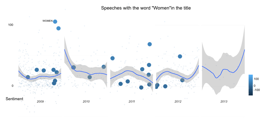
Looking only at Hillary’s remarks at the US state department from 2009 to 2013, she gave a lot more speeches in her first year as Secretary of State. Clinton is knows for being a women’s right activist. It is not surprising that the word “Women” was part of many speeches she gave as Secretary of State.
What are Hillary’s 2016 campaign speeches all about?
We want to find out the core topics Hillary Clinton spoke about in her campaign speeches. For this, we will use the tidytext function bind_tf_idf(). From our scraping activity, we received 96 speeches from Hillary’s 2016 campaign website. Let’s tidy up the dataset first, and then perform a term-frequency-inverse-document-frequency (ft-idf) analysis on the text corpus.
library(dplyr)
library(tidytext)

# read in the data:
pr_2016 <- read.csv("clinton_2016.csv", header = T, stringsAsFactors = F)
pr_2016 <- pr_2016 %>% group_by(wann) %>% mutate(group_speech = n()) %>% ungroup() %>% select(-X)

speeches_2016 <- pr_2016 %>% group_by(wann) %>% unnest_tokens(word, speech1) %>% count(wann, word, sort = T)

speeches_2016_total <- speeches_2016 %>% group_by(wann) %>%summarise(all_speeches = sum(n))

speeches_2016 <- left_join(speeches_2016, speeches_2016_total)

speeches_2016 <- speeches_2016 %>% bind_tf_idf(word, wann, n)

## Plotting the highest frequency for each speech over time:
speeches_2016_termFr_plot <- speeches_2016 %>%
  group_by(wann) %>%
  filter(tf_idf == max(tf_idf))

speeches_2016_termFr_plot_dates <- speeches_2016_termFr_plot %>%
  mutate(dates = as.Date(as.character(wann), "%B%d,%Y")) %>%
  filter(dates != "2015-05-19") %>%
  filter(all_speeches < 50000) %>%
  mutate(word = toupper(word))

ggplot(speeches_2016_termFr_plot_dates, aes(dates, all_speeches, label = word)) +
  geom_point(alpha = 0.5) +  geom_line(alpha = 0.1, size = 3) +  theme_bw() + ggtitle("TF IDF analysis of Hillary Clinton speeches, 2016") +
  geom_text(check_overlap = T, size = 3, nudge_x = 6, aes(label = word)) + ylab("Number of words in speech") + xlab("2016, dates")
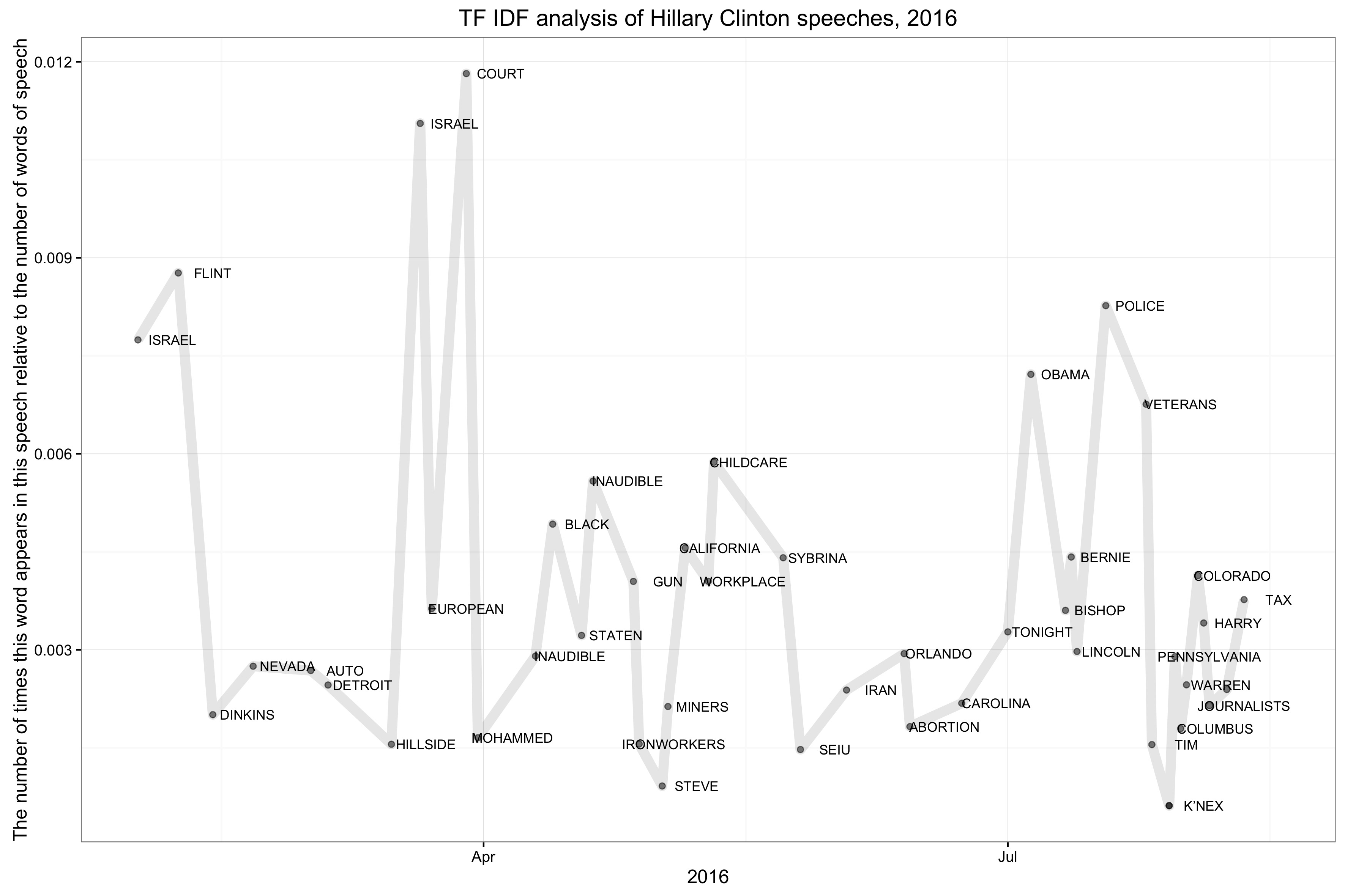
In this chart, we can visualize TF-IDF Hillary’s speeches over time. The Y axis shows the number of words the term appeared in a speech relative to the overall number of words in each speech. The X axis represents dates the speeches were given (according to Hillary’s campaign blog). The line gives you an idea of the most frequent terms calculated against the most frequent terms across the entire set of speeches. It gives us a relatively good understanding of the topics she talked most frequently about, and how this changed over the course of the presidential-rally.
To make things more interesting, we can compare it to the number of occasions for each speech when she mentioned “Trump” (also measured in term frequency). In speeches, Trump’s name was mentioned along “Court”, “California”, and “Police”.
ggplot(speeches_2016_termFr_plot_dates, aes(dates, tf, label = word)) +
  geom_point(alpha = 0.5) + geom_line(alpha = 0.1, size = 3, aes(col = "tf")) +  theme_bw() + ggtitle("TF IDF analysis of Hillary Clinton speeches, 2016") +
  geom_text(check_overlap = T, size = 3, nudge_x = 6, aes(label = word)) + ylab("The number of times this word appears in the speech") + xlab("2016, dates") +
  geom_line(inherit.aes = F, alpha = 0.1, size = 3, data = speeches_2016_termFr_plot_trump_dates, aes(dates, tf)) +
  geom_point(inherit.aes = F, data = speeches_2016_termFr_plot_trump_dates, aes(dates, tf, color = "Trump mentioned")) + scale_colour_brewer(palette = "Set1")
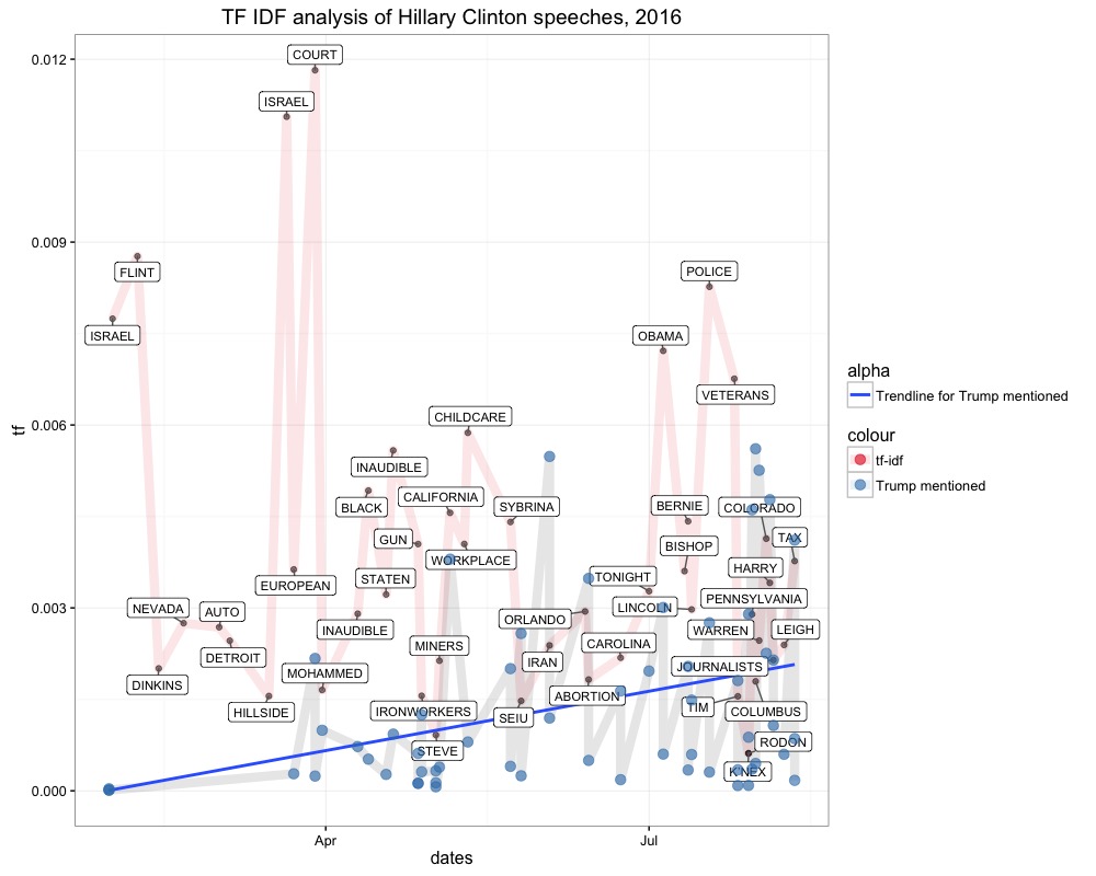
Trump’s name fell increasingly over the past months, possibly a strategic answer to Trump’s verbal assaults in his hate speeches. She must have mentioned and attacked him more heavily also in the course of his increasing chances of winning.
Who is Hillary’s speeches most aligned with?
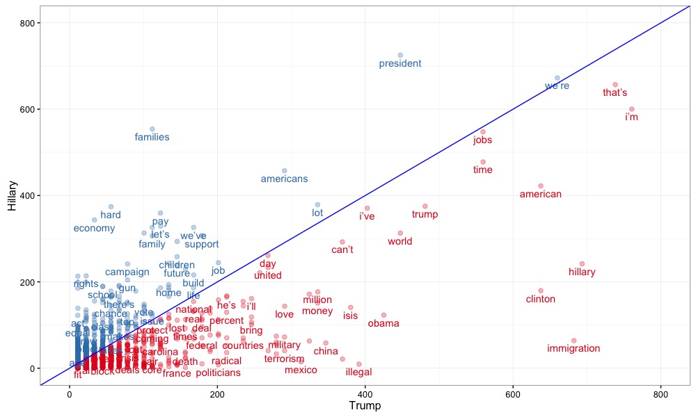
Politicians have their own style of course, but could we find out how her word frequencies differ to other member of the political family. Comparing Hillary’s speeches with campaign speeches by Barack Obama in 2012, we understand that both aren’t pretty well aligned. If aligned, the chart would look different. The dots would cluster more heavily around blue line and be less spread out to the X and Y dimensions.
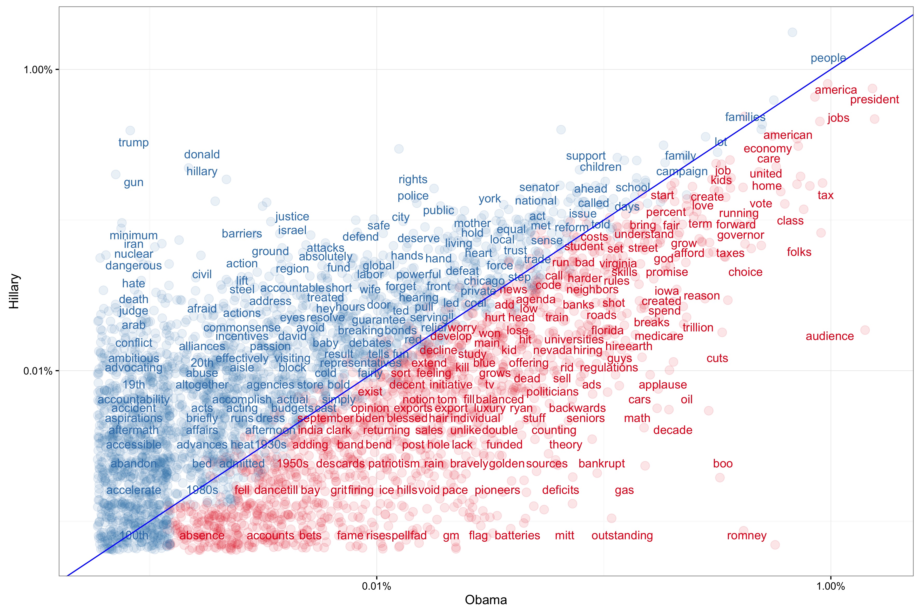
If we do it for Trump’s campaign speeches, there is even a wider spread. This comes at no surprise. Both political figures have a very distinct speaking style.
Unsupervised learning: clustering Hillary’s 2016 campaign speeches
Clustering is an unsupervised machine learning task, helping with automatically dividing our speech data into topic clusters. The aim of this exercise is to find the natural grouping of the speeches, which we will try to label later. We have seen that Hillary discussed varies topics, including childcare, the police and veterans. Without further knowledge of what comprises a speech cluster, how can a computer know where one group ends and another begins? The answer lies in the concept of similarity.
The first step is to tokenize our document again, using the wonderful tidytext package. Each document is a date the speech, or multiple speeches were delivered (in the data we find dates that feature multiple speeches).
library(dplyr)
library(tidytext)
library(stringr)
library(tidyr)
speeches_2016_unnest_tokens <- speeches_2016_correlation %>%
     tidytext::unnest_tokens(word, text) %>%
     anti_join(stop_words) %>%
     count(docdate, word, sort = TRUE) %>%
     ungroup()
To feed our data to a clustering model - we will use the topicmodels package -, we need the data to be in the form of a Document Term Matrix. The cast_dtm() function in the tidytext package allows us to cast our speech data into a one-token-per-row table of the class DocumentTermMatrix.
speeches_2016_dtm <- speeches_2016_unnest_tokens %>%
                     cast_dtm(docdate, word, n)

class(speeches_2016_dtm)
 # [1] "DocumentTermMatrix"    "simple_triplet_matrix"
Once we have our Document Term Matrix in place, we can let the Topicmodels package do the rest of the work, and cluster each speech. Before we do this however, we want to choose an appropriate k value. k describes the number of clusters we want the model to bin our speech documents by. In this case we chose 15. However this number is arbitrary. In fact, what we see is that there are really 5 main clusters, the biggest one concerns people. However, as we only observing here the most frequent appearances, we should be careful to rely too heavily on the most frequent instead of subsequent most frequent terms.
Most frequent terms our cluster model identified: 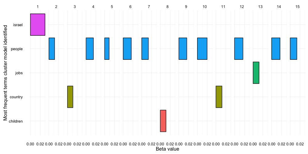
For a different approach, we could play around with k. In a new case scenario, we might want to classify and set k to 3. An explaination why we do so, can be found in the code. We refer to the “elbow method”.
topicmodel_hillary <- LDA(speeches_2016_dtm, k = 3, control = list(seed = 100))

hillary_lda_gamma <- tidytext:::tidy.LDA(topicmodel_hillary, matrix = "gamma")
class(hillary_lda_gamma)
# [1] "tbl_df"     "tbl"        "data.frame"

hillary_lda_gamma <- hillary_lda_gamma %>%
  filter(document != "May 19, 2015") %>%
  filter(gamma > 0.9) # we filter the ones with a high gamma value

topicmodel_hillary_tidydata <- tidytext:::tidy.LDA(topicmodel_hillary)
topic_terms_1 <- topicmodel_hillary_tidydata %>%
  group_by(topic) %>%
  top_n(1, beta) %>%
  ungroup() %>%
  arrange(topic, -beta)

hillary_lda_gamma <- hillary_lda_gamma %>%
  inner_join(topic_terms_1)

ggplot(hillary_lda_gamma, aes(as.Date(document, "%B%d, %Y    "), fill = as.factor(topic))) +
  geom_bar(show.legend = T, aes(position = "fill")) +
  ylim(0, 1) + theme_bw() +  scale_colour_brewer(palette = "Set1") +
  theme(
    axis.text.y = element_blank(),
    axis.ticks = element_blank()) + ylab("") + xlab("2016, time speeches were given")
If we run this in ggplot, we can see that Hillary had three distinct groups of speeches. Cluster one is concerned with the people and presidency (in red), cluster two on the job market and the country, and a third one on Donald Trump (showing up correctly in blue in most recent times when she must have mentioned him most frequently, in the midst of the campaign race). 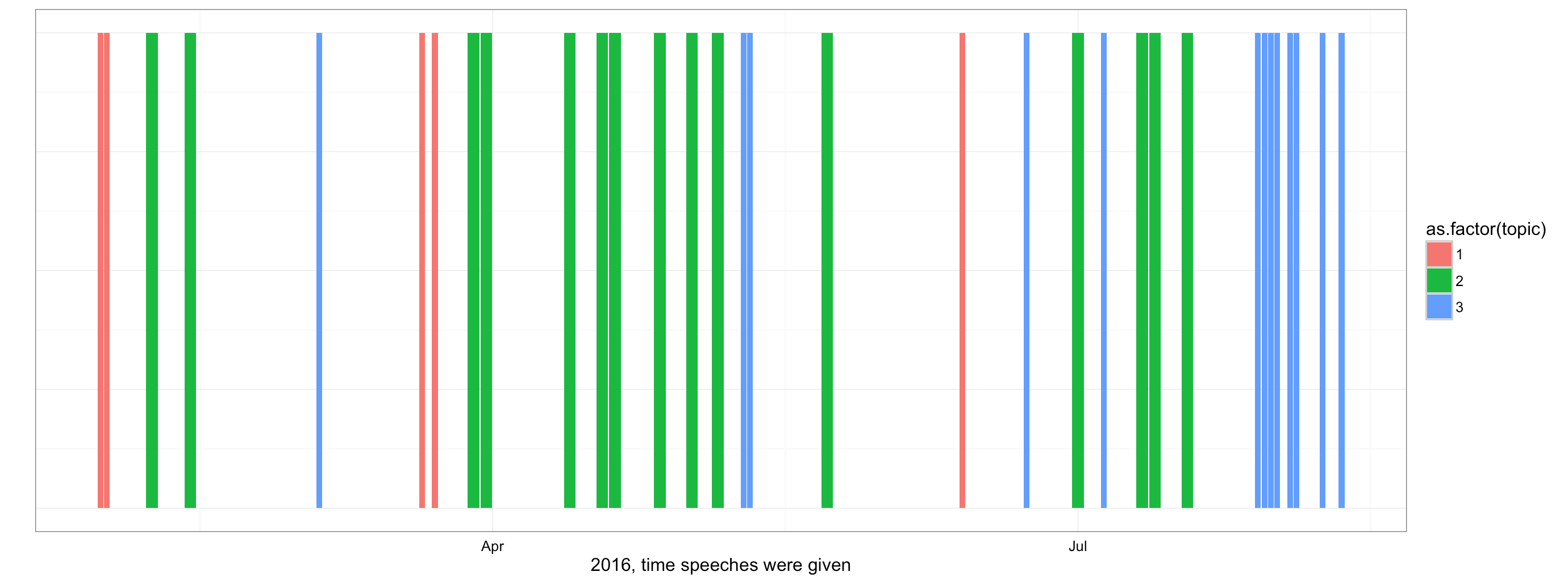
Clustering with K-means
Clustering with k-means is another unsupervised classification method. Again, the catch is that the class labels obtained from an unsupervised classier are without intrinsic meaning, and needs our domain knowledge for labelling. This time we make use of the stats package. For this, our previous document-term matrix is perfect as an input.
library(stats)

# set k
set.seed(1000)
topicmodel_hillary_kmeans <- kmeans(speeches_2016_dtm, 3)

# creates a kmeans object
class(topicmodel_hillary_kmeans)
# [1] "kmeans"

# The distribution of the clusters
topicmodel_hillary_kmeans$size
# [1] 42  1  4

topicmodel_hillary_kmeans:
(Here the percentage of variance is calculated as the ratio of the between-group variance to the total variance)
#If we want to calculate the sum of squares by cluster
topicmodel_hillary_kmeans$betweenss /topicmodel_hillary_kmeans$tots = 0.8553458 or 85.53%

# for k = 2, we get: 79.4 %, for 3 = 85.5 %, for 4 = 87.36 and for 5 = 88.13 % (we could locate the "elbow" at k = 3)
We chose k = 3 according to the Elbow method, that looks at the percentage of variance explained as a function of the number of clusters. One should choose a number of clusters so that adding another cluster doesn’t give much better modeling of the data.
The data given by x are clustered by the k-means method, which aims to partition the points into k groups such that the sum of squares from points to the assigned cluster centers is minimized. At the minimum, all cluster centers are at the mean of their Voronoi sets. We see that the model binned the speeches somewhat unevenly.
# We use data.table to get the clusters and dates of our documents into a df
library(data.table)
df <- as.data.frame(topicmodel_hillary_kmeans$cluster)
setDT(df, keep.rownames = TRUE)[]
names(df)[1] <- "docdate"
names(df)[2] <- "cluster"

# Perform an inner join:
speeches_2016_unnest_tokens_join <- speeches_2016_unnest_tokens %>%
  inner_join(df)

# Show clusters in speeches over time, and most frequent words:
speeches_2016_unnest_tokens_join_plot <- speeches_2016_unnest_tokens_join %>%
  group_by(docdate) %>%
  top_n(n=1) %>%
  summarise(cluster = (mean(cluster)), wordmax = (max(n, word)), max = max(n)) %>%
  filter(docdate != "May 19, 2015")

  ggplot(speeches_2016_unnest_tokens_join_plot, aes(as.Date(docdate, "%B%d, %Y    "), y = 0.5, col = as.factor(cluster), size = max, show.legend = F)) +
           geom_point(show.legend = F) + scale_size(range = c(0, 30)) +
   ylim(0, 1) + theme_bw() +
  geom_label_repel(show.legend = F,
    aes(as.Date(docdate, "%B%d, %Y    "), y = 0.5, fill = factor(cluster), label = (wordmax)),
    fontface = 'bold', color = 'white',
    box.padding = unit(0.25, "lines"),
    point.padding = unit(0.5, "lines")
  ) +
    theme(
      axis.text.y = element_blank(),
      axis.ticks = element_blank()) + ylab("") + xlab("2016, date speeches were given")
Most frequent terms our cluster model identified with the K-means clustering model: 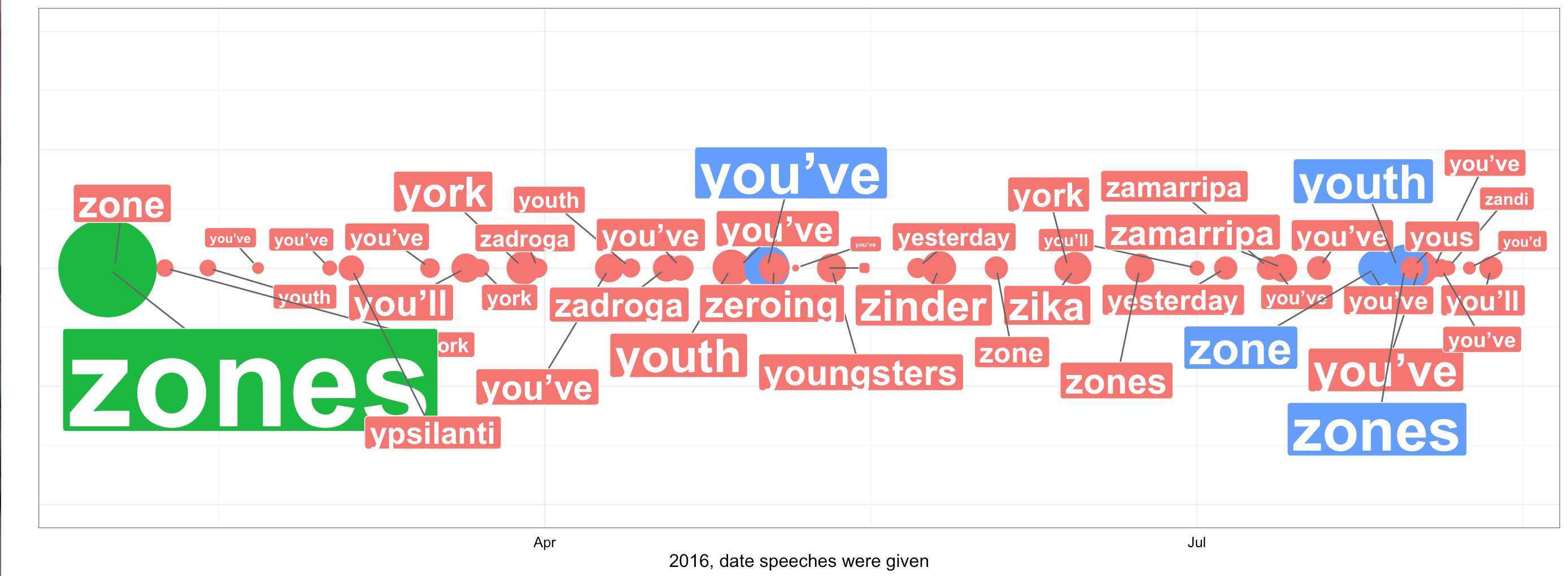 We get a somewhat different result. We see that it hardly reflects the rally. After the convention in August the class changes from green to blue in the previous model, but here we see little change. Hillary talked much more about Trump, and as she knows that she is now the final opponent, she should change her topics accordingly. The green bubble is a bit flawed, as it comprises multiple speeches given on the same date. We can observe that our k-means model has some difficulties to cluster the speeches in equal bins. This could imply that speeches may have been very similar across her campaign rally, or a poor selection of k and the absence of clean data.
Wrapping up
In this post we learned that Hillary’s strategy to speak is one that remains on the positive side, that her latest campaign speeches must have featured more emotional language in 2016 than in 2008, which increased the spread for sentences’s sentiment scores. We also understand now how she compares to other speakers at the presidential convention, and Barack Obama for the campaign speeches. She is not a copycat, and her speech varies considerably. We saw evidence on her standing on women’s rights, an overview of the key topics she covered in her 2016 campaign rally, and how they relate to assaults on her opponent Trump.
We also learned that it might be harder to correctly classify her speeches into equal groups with k-mean and that Latent Dirichlet allocation with the topicmodels package might be a better choice for topic classification. As we managed to apply machine leaning to get a rough idea of possible labels with LDA, that included children and the future, the job market, country domestic matters, Israel and a large group for the rest (mainly concerning voters issues), we didn’t manage to success with k-means.
NLP is hard, and there is a long way to go to finally apply this to data journalism on a large scale. I can’t wait to publish the next post :-)


Leave a Comment